Welcome to our guide on creating serene spaces with the best Japandi color palette!
If you're looking to infuse your home with the tranquility of Scandinavian function and Japanese minimalism, you've come to the right place.
In this article, we'll reveal our top picks and recommendations for achieving a harmonious and peaceful atmosphere in your living spaces.

Stay tuned as we dive deeper into the world of Japandi design, uncovering the significance of incorporating nature-inspired elements and textures.
Plus, we'll share valuable insights on accentuating Japandi-inspired spaces with subtle Japanese and Scandinavian influences.
Discover how to create serene and tranquil spaces that evoke a sense of calm and relaxation.
So, let's get started on transforming your home into a serene haven with the best Japandi color palette.
Together, we'll explore the magic of this design trend and unlock the secrets to creating peaceful and inviting spaces that you'll love coming home to.
In this section, we will explore the principles of the Japandi aesthetic, which beautifully combines the simplicity of Scandinavian design with the comfort of Japanese minimalism.

Japandi style embraces the harmony found in simplicity and the warmth created by comfortable living spaces.
It is a perfect balance between functionality and aesthetics, creating a serene and inviting atmosphere in your home.
One of the key elements of the Japandi aesthetic is the incorporation of wabi-sabi and hygge principles.
Wabi-sabi is a Japanese concept that celebrates imperfections, simplicity, and the beauty of natural materials.
It encourages us to appreciate the authenticity and uniqueness of each object, embracing the passage of time and the inherent beauty of aging.
Hygge, on the other hand, is a Danish concept that emphasizes coziness, comfort, and well-being.
It promotes a sense of warmth, relaxation, and contentment, creating a sanctuary within your home.
By combining wabi-sabi and hygge, Japandi design brings a sense of calm and tranquility, fostering a harmonious and inviting atmosphere in your living spaces.

Neutrals play a significant role in the best Japandi color palette. They are essential for creating a serene environment that allows you to unwind and relax.
Neutrals such as soft whites, warm grays, and muted beiges promote a sense of tranquility and serenity in your home.
By focusing on neutrals, Japandi design allows other elements, such as natural materials, textures, and patterns, to shine.
Neutrals provide a versatile backdrop that enables you to mix and match various elements, creating a cohesive and visually pleasing space.
They also contribute to the timeless and understated elegance that is characteristic of Japandi design.
In Japandi design, the color palette plays a crucial role in creating serene and calming spaces.
Neutrals such as whites, grays, and beiges are key elements that contribute to the overall tranquility of Japandi-inspired interiors.

Whites are often used as the main color in Japandi interiors, evoking a sense of purity and simplicity.
They create a light and airy atmosphere, making the space feel open and spacious.
Grays, on the other hand, add depth and sophistication to Japandi color schemes.
They bring a sense of calmness and neutrality, providing a perfect backdrop for natural elements and organic textures.
Beiges, with their warm undertones, contribute to the overall harmony in Japandi design.
They create a cozy and inviting ambiance, inviting relaxation and serenity.
By combining these Japandi neutrals, you can create a harmonious color palette that promotes a calm and peaceful environment in your home.
Here are some examples of Japandi color schemes using whites, grays, and beiges:
| Color Scheme | Color Palette |
|---|---|
| Minimalist Serenity | White + Light Gray + Beige |
| Natural Oasis | White + Medium Gray + Beige |
| Timeless Elegance | White + Dark Gray + Beige |
Incorporating earth tones and muted colors is essential for adding depth to the Japandi color palette.
These colors play a significant role in evoking a sense of groundedness and warmth, enhancing the overall serenity of Japandi-inspired spaces.
Earth tones, such as warm browns, soft greens, and gentle grays, create a connection to nature and bring a calming influence to the room.
They add a sense of depth and richness, making the space feel more vibrant and alive.
Muted colors, such as soft blues, pale pinks, and dusty yellows, have a calming effect and contribute to the serene ambiance of Japandi design.
They bring a subtle touch of color without overpowering the space, creating a harmonious and balanced environment.
By combining earth tones and muted colors in your Japandi-inspired space, you can create a color palette that is both soothing and visually engaging.
These colors have a timeless appeal and can be used in various elements of the room, from walls and furniture to accessories and textiles, to achieve a cohesive and tranquil atmosphere.

Nature plays a significant role in Japandi design, creating a harmonious blend of Scandinavian simplicity and Japanese minimalism.
To fully immerse yourself in the Japandi aesthetic, it's essential to incorporate elements of nature into your color palette.
By embracing greenery and organic hues, you can infuse your space with a sense of tranquility and serenity.
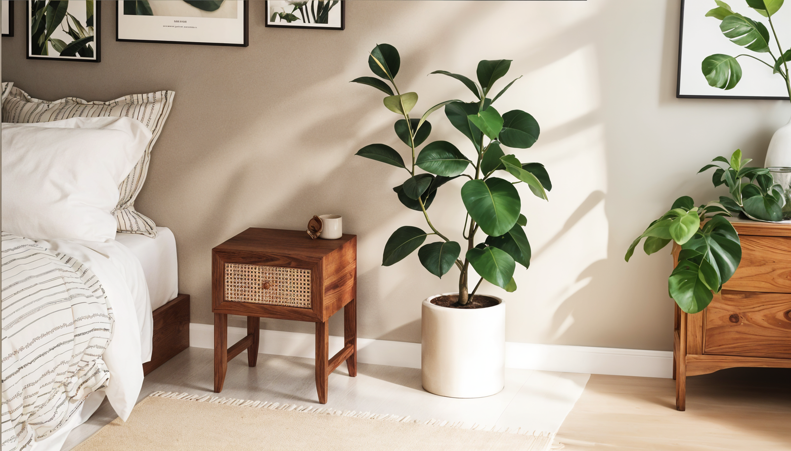
Indoor plants are an excellent way to enhance the Japandi color palette. They bring life and vitality to your space while adding a touch of natural beauty.
The vibrant greens of plants provide a refreshing contrast to the neutral tones of the modern Japandi color scheme.
Whether you opt for small potted plants or larger statement pieces, indoor plants create a connection to nature and evoke a sense of peace and calmness.

When selecting colors for your Japandi-inspired space, draw inspiration from the natural world.
Organic hues such as earthy browns, warm oranges, and soft blues can create a soothing and serene atmosphere. Incorporate these popular japandi colors into your furnishings, decor, and accent pieces to bring a touch of nature indoors.
Remember, the minimalist Japandi color palette is characterized by its simplicity and muted tones, so choose hues that emulate the peace found in natural elements.
In order to create serene and tranquil spaces, it is crucial to choose the best Japandi color palette.
Colors play a significant role in setting the mood and ambiance of a room, and Japandi design aims to evoke calm and tranquility through carefully selected hues.
When selecting colors for your Japandi-inspired space, it's important to focus on shades that promote relaxation and harmony.
Neutrals are the foundation of the soothing Japandi color palette, with whites, grays, and beiges being the go-to choices.
These understated colors create a calming backdrop and allow other elements of the room to shine.
Incorporating earth tones and muted colors is another way to add depth and warmth to your Japandi color palette.
Colors inspired by nature, such as soft greens and organic hues, can help create a sense of tranquility and connect your space to the outdoors.
To achieve a cohesive color scheme, it's essential to consider the interplay between colors within your Japandi-inspired space.
Opt for a balanced combination of light and dark tones to create contrast and visual interest.
Dark accents can be used strategically to add depth, while light contrasts can create a bright and airy atmosphere.
By choosing the best Japandi color palette, you can create spaces that evoke calm and tranquility.
The right colors will set the tone for your Japandi-inspired design and contribute to a serene and harmonious environment.
In Japandi design, the fusion of Japanese and Scandinavian influences creates a unique aesthetic that exudes simplicity and harmony.
To enhance this style in your home, incorporating subtle elements from both cultures can elevate your space to a new level of sophistication.
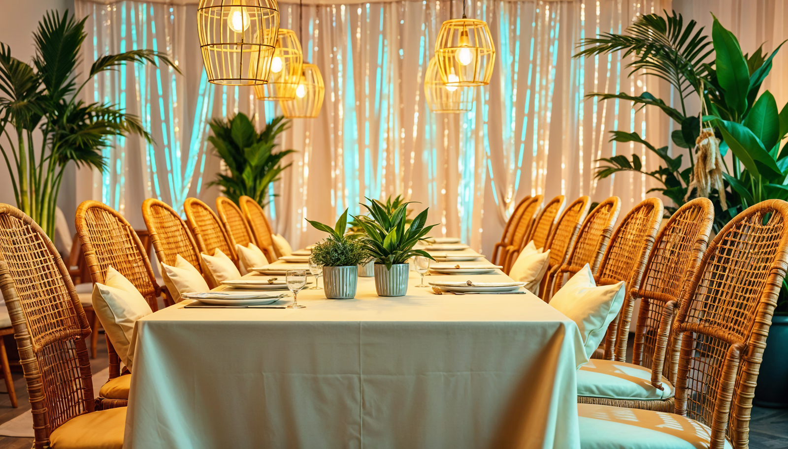
One way to accentuate the Japandi design is by incorporating dark accents and playing with light contrasts.
These elements add visual interest and depth to the overall color palette, creating a captivating ambiance.
Dark colors, such as deep browns or charcoal grays, can be used sparingly as accents to create focal points or to highlight specific design features.
Pairing these dark accents with lighter neutral tones, like whites, beiges, or light grays, creates a beautiful contrast that adds dimension and balance.
The interplay between light and dark elements brings a sense of drama and sophistication to the space, enhancing its overall aesthetic appeal.
Japandi design embraces minimalist color schemes, further emphasizing the blend of Japanese and Scandinavian influences.
The color palette is typically kept simple and understated, focusing on the use of neutral tones and earthy hues.
Minimalist color schemes allow for a calm and serene ambiance, promoting a sense of tranquility and mindfulness.
By keeping the color palette restrained, the focus shifts to the clean lines, textures, and natural materials used in the space.
This approach creates a harmonious balance and quiet sophistication that defines the Japandi aesthetic.
When selecting colors for a Japandi-inspired space, consider hues like whites, grays, beiges, muted greens, and earthy tones.
These on-trend japandi color combinations will complement the minimalist aesthetic and provide a serene backdrop, allowing attention to be drawn to the thoughtful integration of furniture, textures, and natural elements.
Lighting is a crucial element in creating the perfect ambiance for your Japandi-inspired space.
It not only illuminates the room but also enhances the color experience, bringing out the beauty and serenity of the Japandi color palette.
When designing a Japandi-inspired space, it's essential to make the most of natural light.
Natural light creates a sense of openness and tranquility, perfectly complementing the minimalist aesthetic of Japandi design.
To maximize natural light, consider the following tips:
By harnessing natural light, you can create a sunny and inviting atmosphere that enhances the Japandi color palette.
While natural light is essential, artificial lighting also plays a significant role in Japandi design.
Choosing fixtures that complement the Japandi color palette ensures cohesiveness and adds warmth and depth to the space.
Consider the following when selecting lighting fixtures:
By selecting lighting fixtures that harmonize with the Japandi color palette, you can elevate the overall aesthetic and create a serene and peaceful environment.
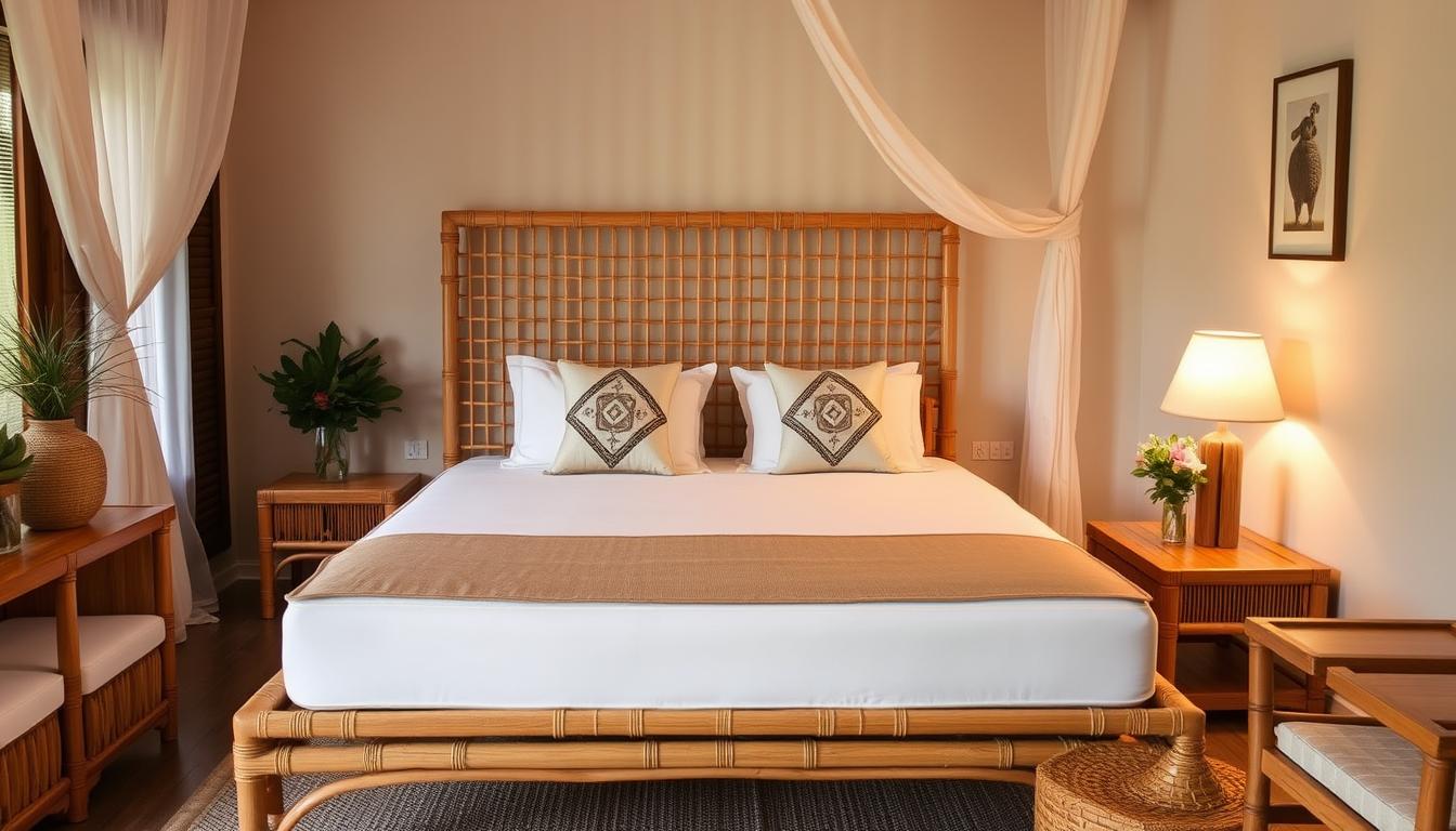
In Japandi design, the use of fabrics and textures is essential for creating a harmonious and serene atmosphere.
The interplay between color and texture plays a significant role in the overall aesthetic, adding depth and visual interest to the space.
By carefully selecting textiles that support the Japandi chromatic narrative, you can enhance the beauty of your Japandi-inspired interiors.
When choosing fabrics for your Japandi-inspired space, opt for natural materials such as linen, cotton, and wool.
These materials not only add texture but also align with the minimalist ethos of Japandi design.
Consider incorporating textiles with subtle patterns or motifs that reflect the understated beauty of nature.
Geometric patterns, organic shapes, or delicate floral designs can evoke a sense of tranquility and balance in your interiors.
For a touch of warmth and coziness, consider adding throws, rugs, or cushions in earthy tones and muted colors.
These hues are an excellent complement to the Japandi color palette and contribute to creating a serene environment.
In Japandi design, the interplay between color and texture is key to achieving a visually captivating space.
The combination of smooth and textured surfaces adds dimension and visual interest, enhancing the serene ambiance.
Pairing soft, muted fabrics with textured elements, such as woven baskets or rattan furniture, creates a balanced and inviting atmosphere.
Consider incorporating textiles with different tactile qualities, such as a plush velvet sofa, against a backdrop of a natural wood wall.
This interplay between the softness of the fabric and the rawness of the wood fosters a sense of harmony and contrast, adding depth to the overall design.

Here are some recommendations for incorporating fabrics and textures into your Japandi-inspired space:
By carefully selecting fabrics and textures that align with the Japandi aesthetic, you can create a serene and visually captivating space that embodies the essence of Japandi design.
| Japandi Shades | Recommended Fabrics and Textures |
| Whites, Grays, and Beiges | Linen, cotton, wool, sheer curtains, textured rugs |
| Earth Tones and Muted Colors | Cushions, throws, woven baskets, rattan furniture |
| Greenery and Organic Hues | Natural materials, plants, textured wallpaper, wood paneling |
Now that you have read the above article, maybe you still have a couple of questions on this topic, so we will answer these questions below.
The best Japandi color palette for creating serene spaces consists of neutral tones such as whites, grays, and beiges.
These colors contribute to a tranquil atmosphere and embody the simplicity and minimalism of Japandi design.
Neutrals dominate the best Japandi color palette because they create a serene and timeless environment.
Neutrals such as whites, grays, and beiges allow for versatility in styling and provide a calm backdrop for other design elements in Japandi-inspired spaces.
Examples of Japandi color schemes using neutrals include combining white walls with light gray furniture and beige accents or opting for a monochromatic palette of varying shades of gray.
These color schemes create a soothing and cohesive look in Japandi-inspired spaces.
Earth tones and muted colors add depth to the Japandi color palette by introducing warm and rich hues inspired by nature.
These colors, such as warm browns, muted greens, and soft blues, create a sense of groundedness and warmth in Japandi-inspired spaces.
The Japandi color palette is timeless and appealing because it embraces simplicity, serenity, and natural elements.
By combining Scandinavian function with Japanese minimalism, the Japandi color palette creates a harmonious and balanced aesthetic that withstands japandi color trends and fosters a sense of tranquility and well-being in your space.
The Japandi color palette offers a harmonious and serene approach to interior design.
Throughout this article, we have explored the principles and elements that make up this unique aesthetic, highlighting its fusion of Scandinavian simplicity and Japanese minimalism.
By understanding the importance of neutrals, earth tones, and organic hues, we can create a color scheme that evokes a sense of calm in our spaces.
Incorporating elements inspired by nature, such as indoor plants, further enhances the tranquility of Japandi-inspired interiors.
Accentuating the design with subtle Japanese and Scandinavian influences, as well as choosing fixtures that complement the color palette, adds depth and interest to the overall design.
Lighting, both natural and artificial, plays a vital role in enhancing the Japandi color experience and creating the desired ambiance.
In conclusion, the Japandi color palette offers a timeless and captivating aesthetic for creating serene spaces.
With its emphasis on simplicity, comfort, and natural elements, Japandi design transforms our homes into tranquil retreats that promote relaxation and well-being.